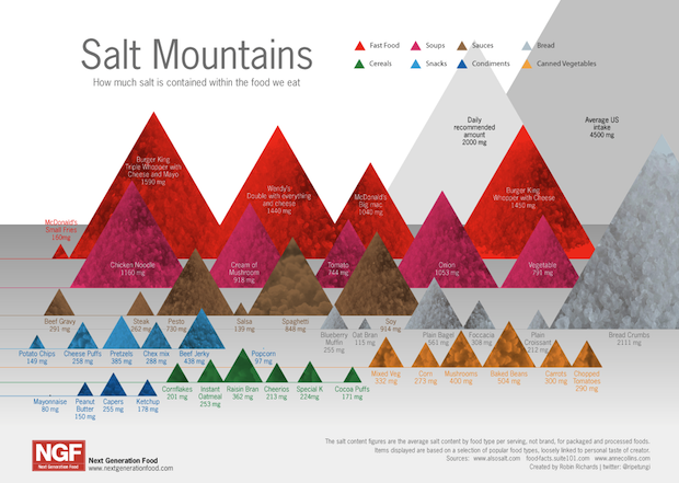
You already know that salt intake is highly correlated with high blood pressure and heart disease. And you probably have a vague sense that processed foods contain a lot of salt. But the specifics are truly terrifying, as this graphic by Next Generation Food shows.
It's not exactly the most legible graph--I mean, triangles aren't exactly a case study in information clarity. But the point comes through. Check out, for example, that fact that a single Burger King Whopper with cheese has 75% of your recommended daily salt intake; and the fact that Americans eat 250% of their recommended daily allotment:

Obviously, eating less meat and more vegetables is an easy way to reducing salt consumption. And the benefits could be vast: An important recent study by the American Heart Association found that just reducing salt intake by a teaspoon could save 200,000 lives every single year.
Their advice? Basically you must avoid as much as possible or even better If it comes in prepackaged and it doesn't rot, don't eat it.